Mad Owl Photography
The Challenge
It’s hard to turn the inspiration of a "school mascot" into a refined and established brand. The end client had a deep personal connection to his high school roots—the "Mad Owls"—and wanted that legacy to lead his new venture.
The hurdle was creating a brand that felt personable and nostalgic for him, but professional and established for his future clients. We needed to move away from "high school spirit" and toward "artist's studio" while keeping the soul of the name intact.
The Strategy
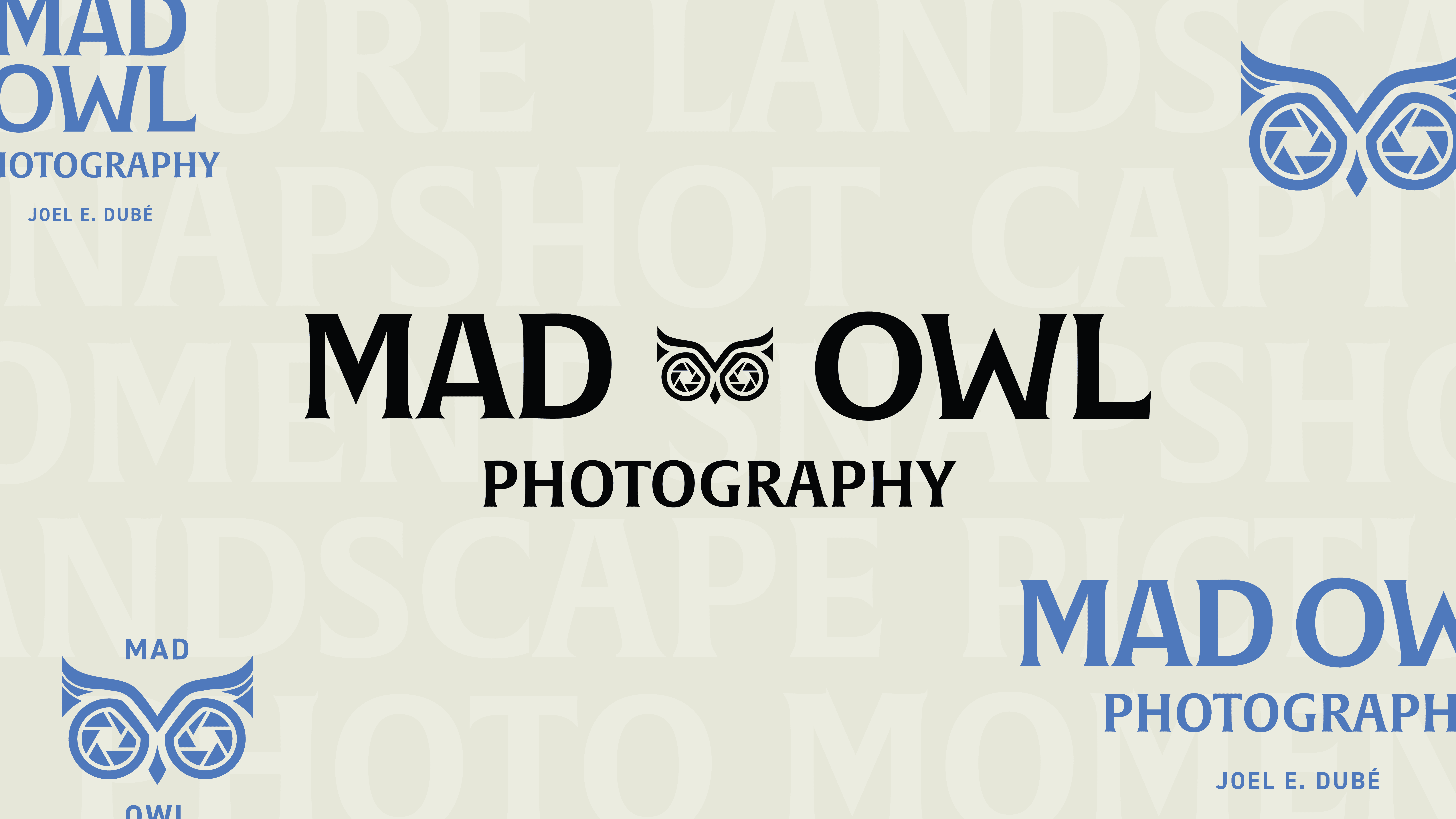
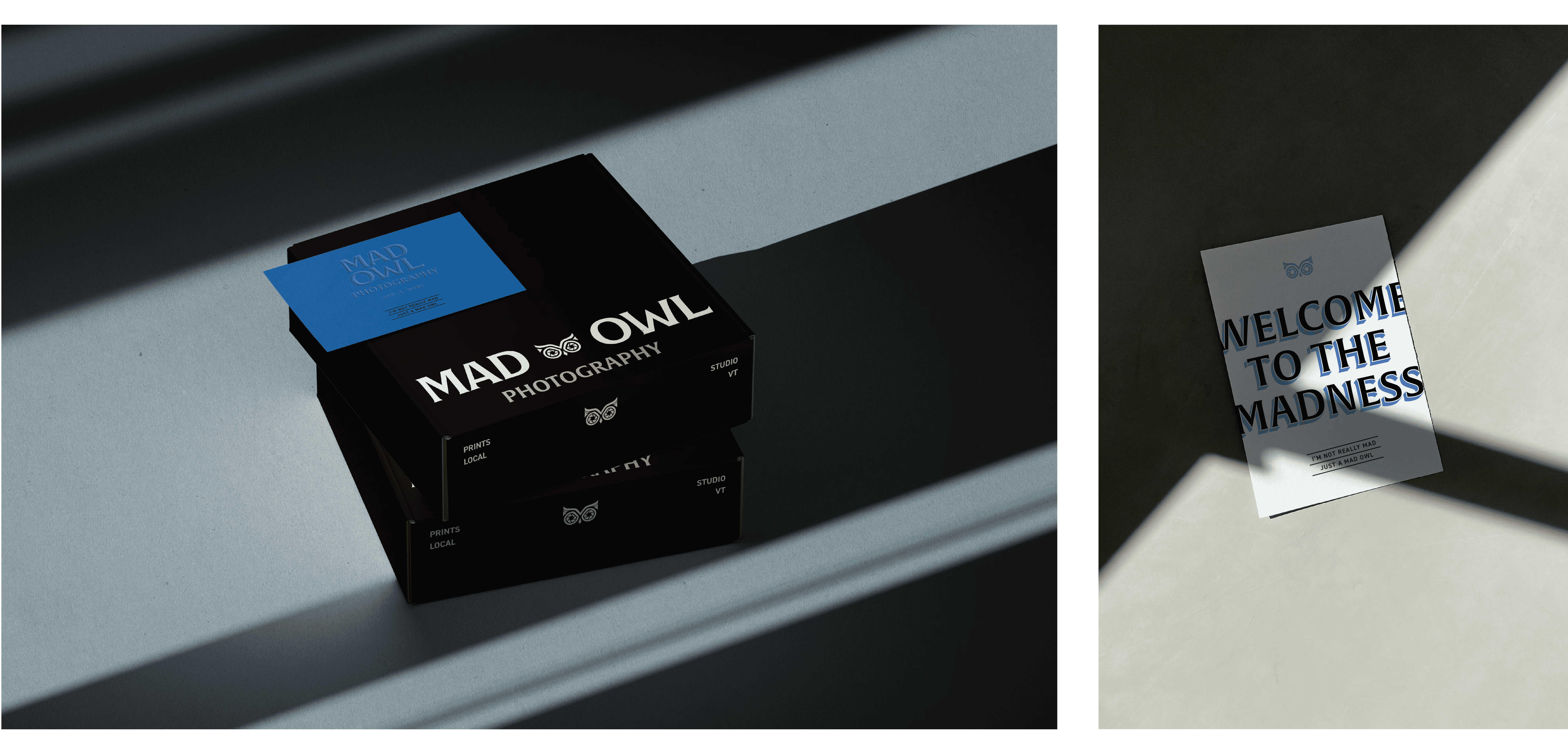
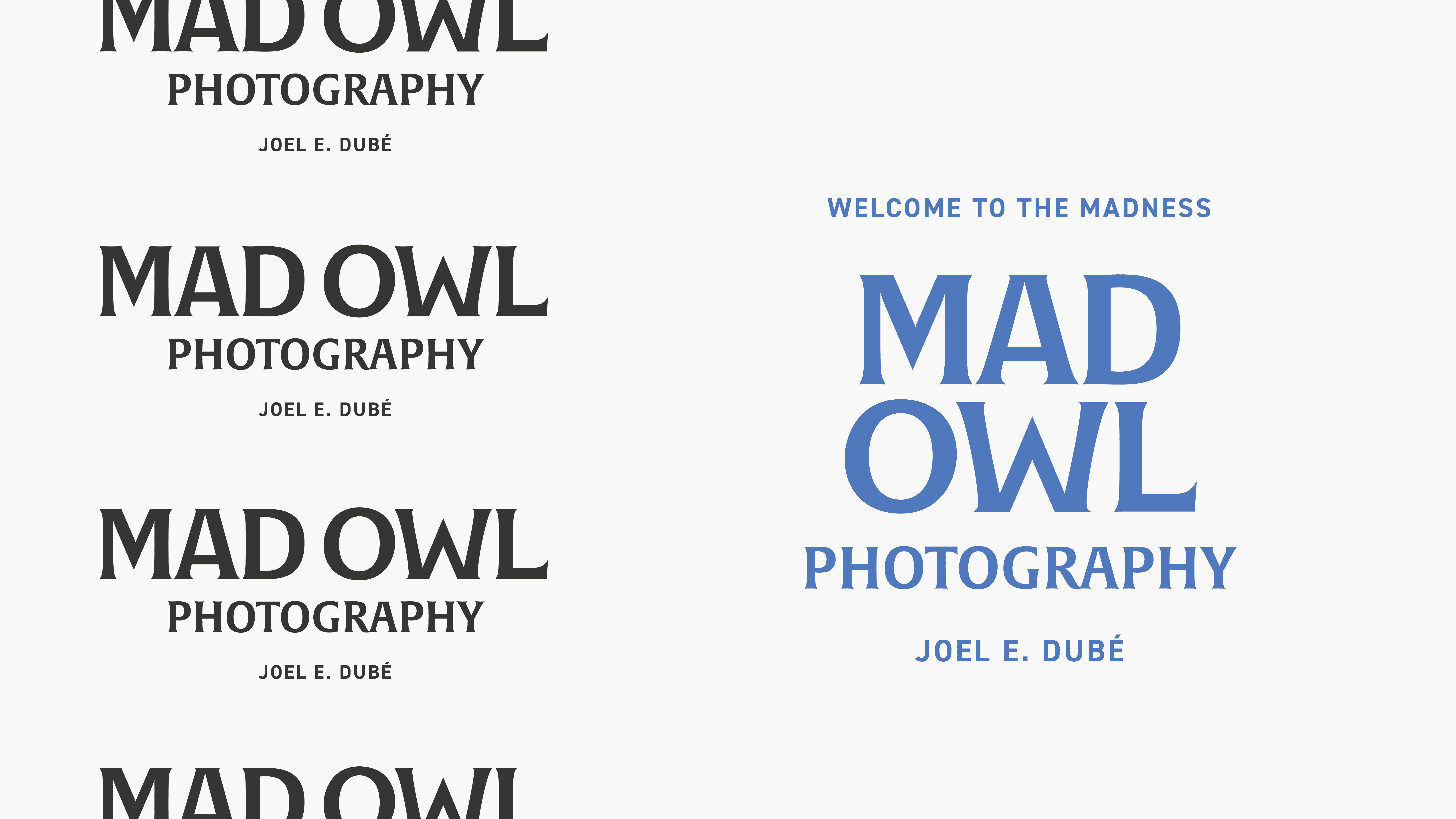
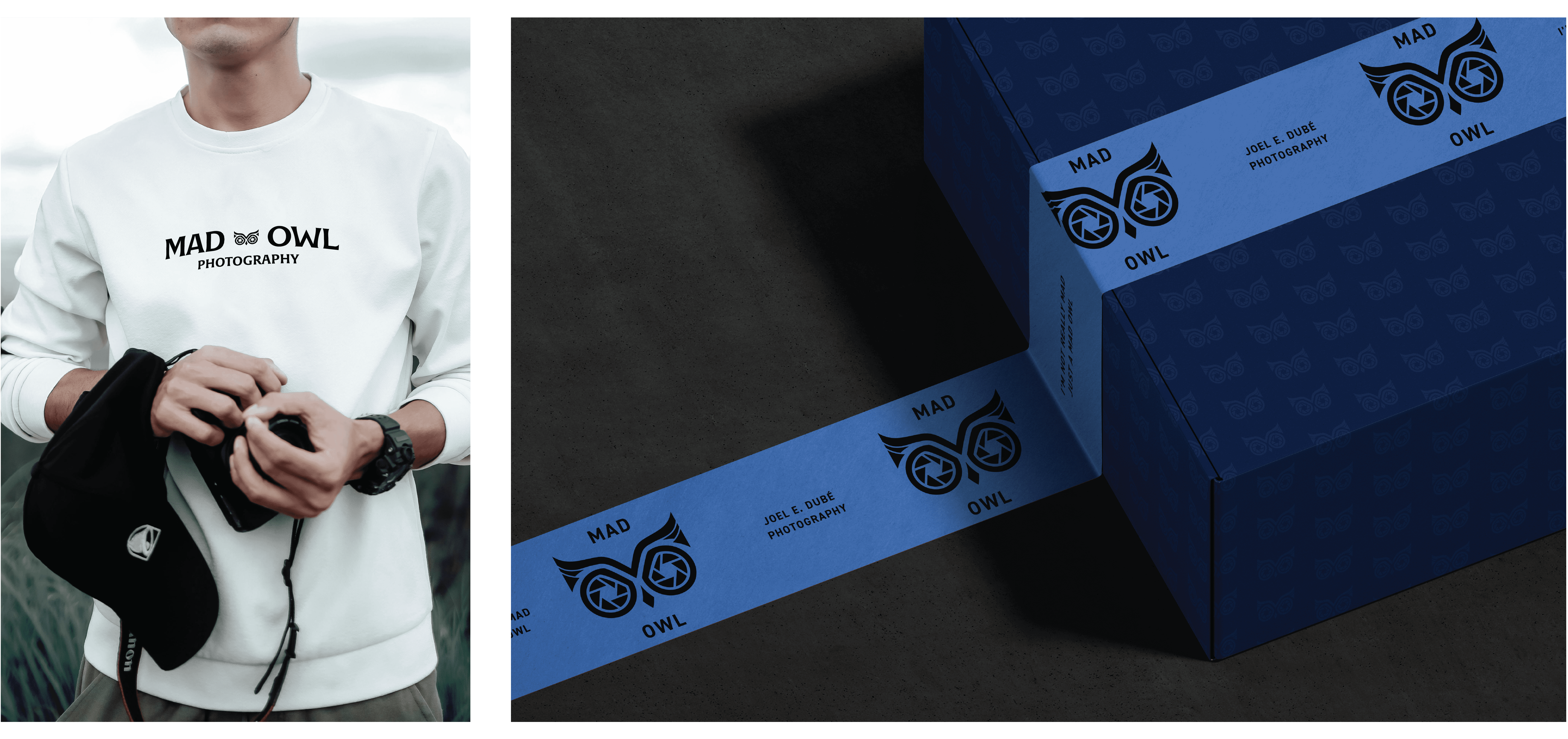
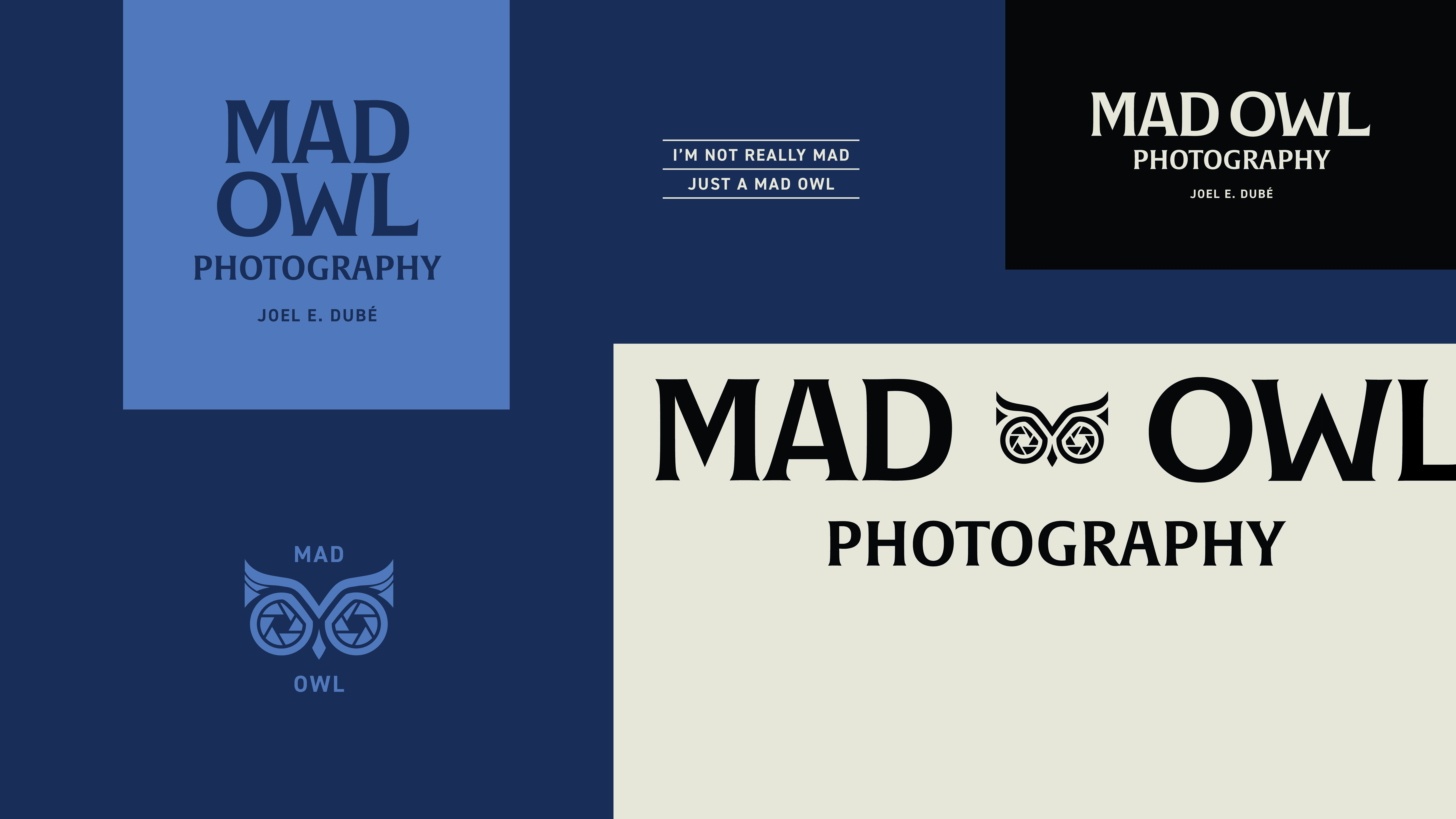
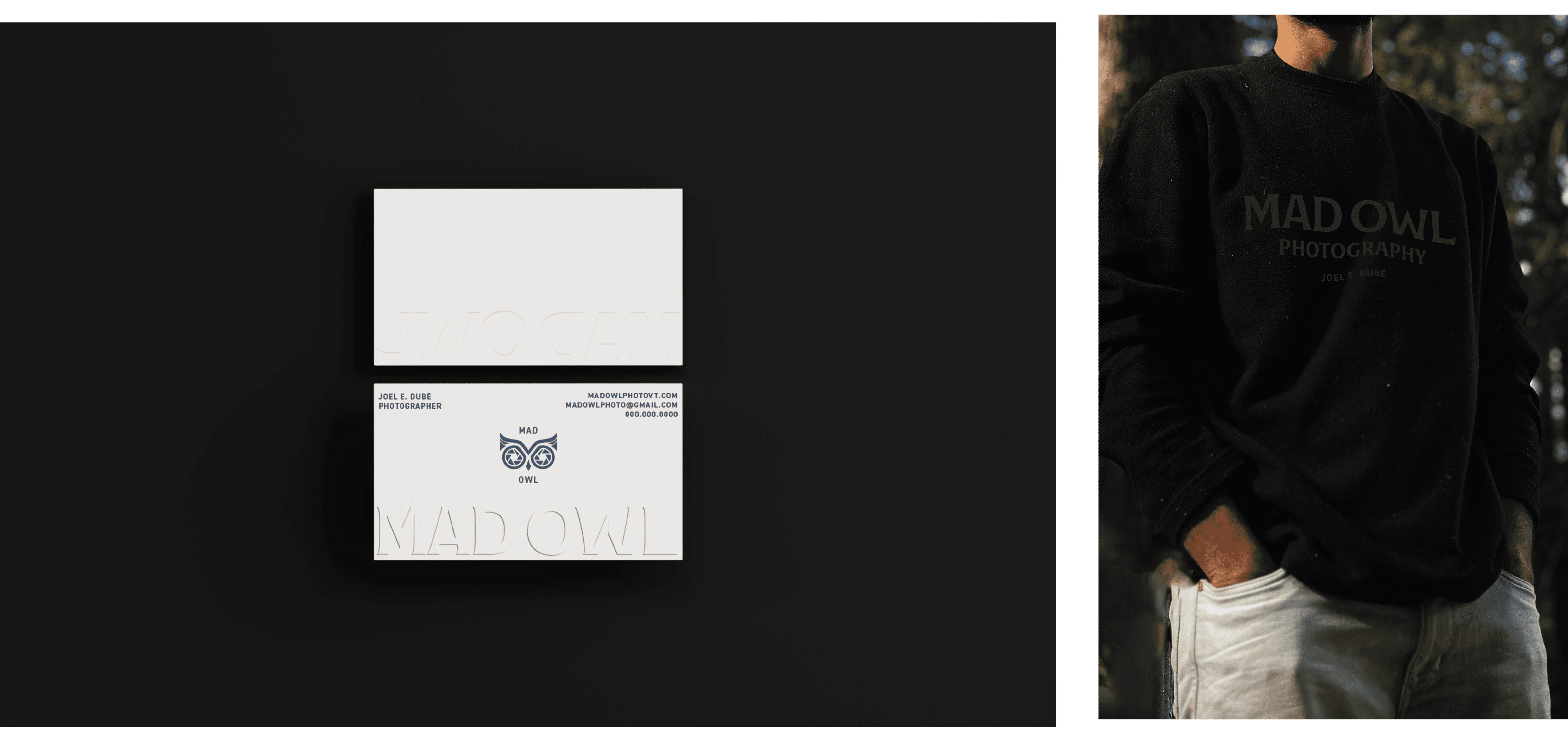
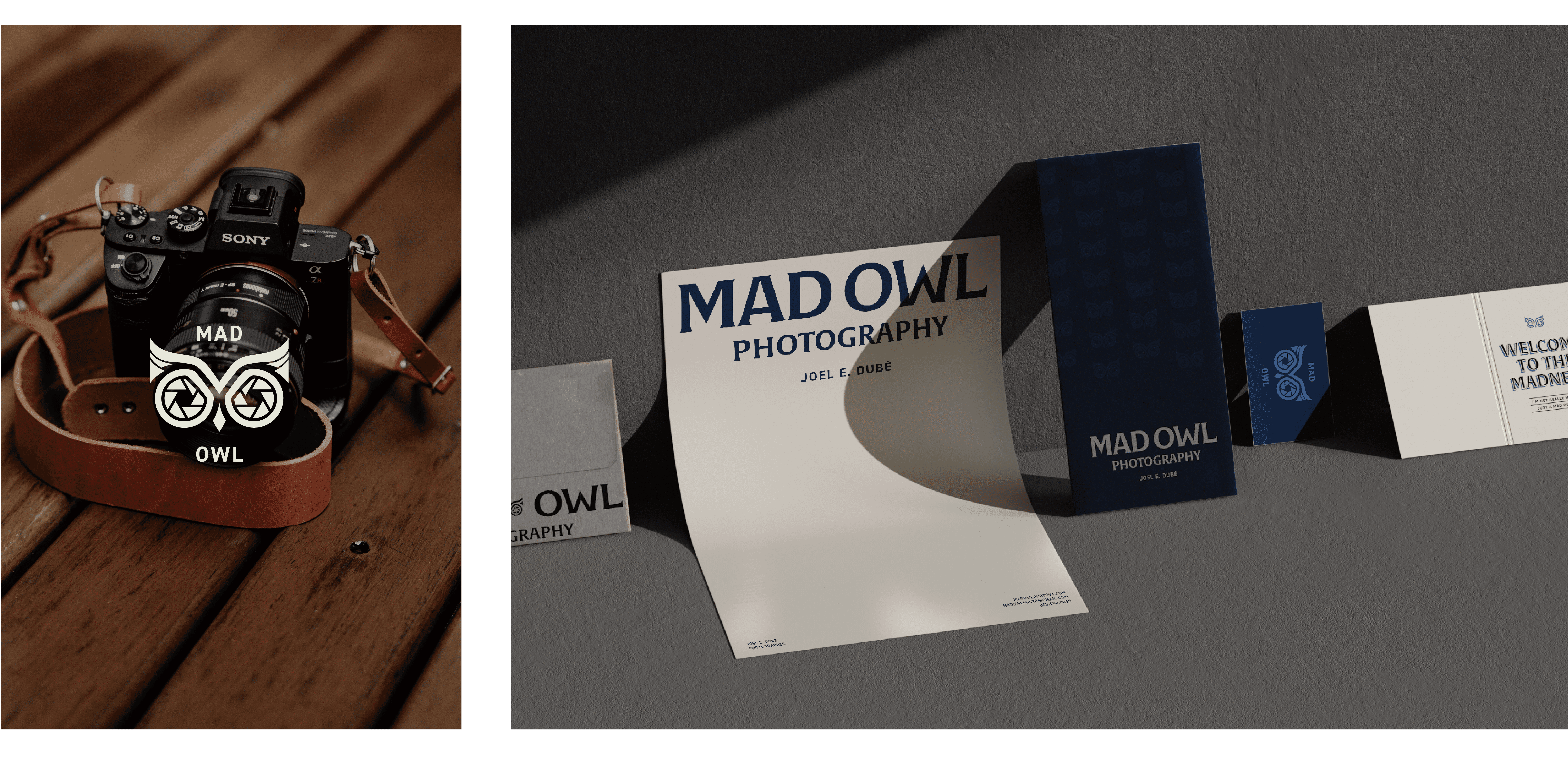
I leaned into a Modern Vintage aesthetic to bridge the gap in this challenge. We started with the color palette: taking the original high school blues and maturing them into a sophisticated, deep navy and slate suite.
Instead of a literal or aggressive mascot, I created a refined "Mad Owl" illustration using clean, modern lines. By pairing this with structured typography, we achieved an "Established" feel—giving a new business the immediate credibility of a seasoned professional. I built out a full style guide to ensure that as his hobby grows into a business, his brand remains consistent, polished, and purposeful.
“A brand name might come from the past, but the design should point toward the future. We took a piece of personal history and polished it into a professional identity that feels as established as the work behind the lens.”
Client Feedback
"I hired Taylor to design a logo for my dad's photography website, and the experience was absolutely wonderful. From the very beginning, she truly listened to my thoughts and needs, providing me with several great options to help bring my vision to life.
One of the things I appreciated most was her professionalism and respect for my budget—she gave me exactly what I asked for and never tried to upsell me on things I wasn't looking for. Taylor was highly communicative throughout the entire process, so I always knew what was going on. She also took feedback incredibly well, applying it seamlessly to refine the design.
The final product turned out even better than I could have imagined! If you're looking for a talented, communicative, and client-focused designer, I cannot recommend Taylor enough."
Sim Dubé