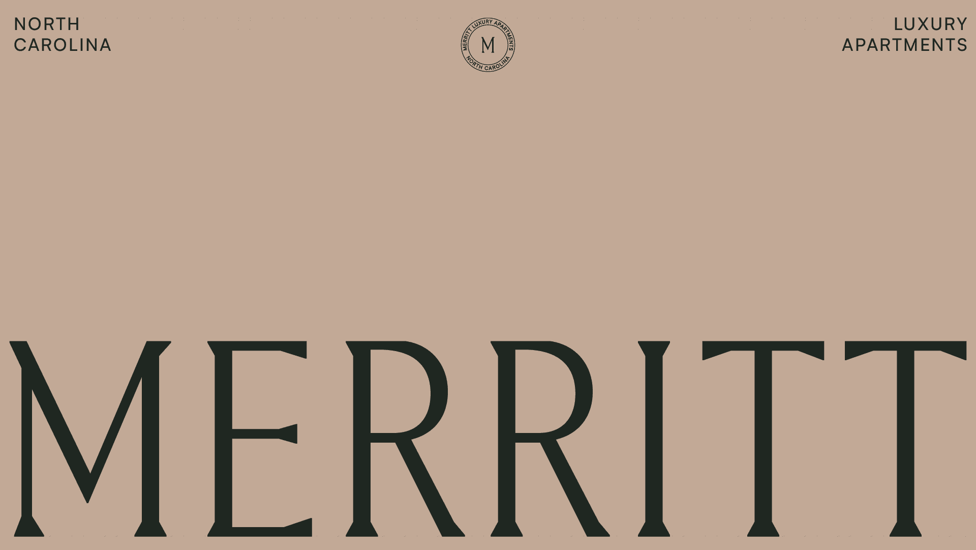
Merritt
The Challenge
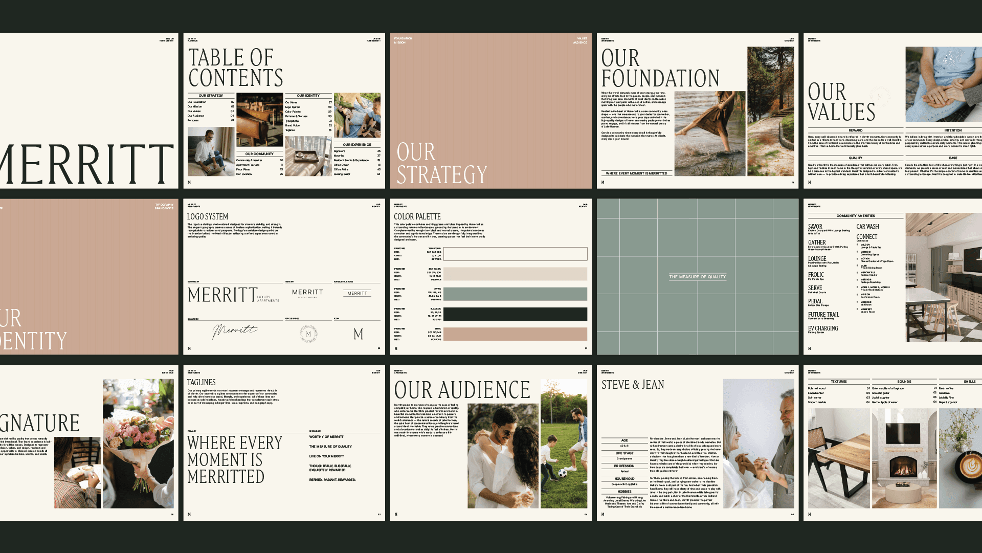
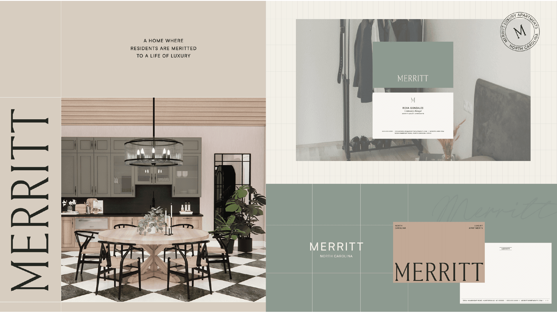
It’s one thing to design a logo; it’s another to keep that vision alive across 14 different projects without it getting watered down. Merritt was positioned as a premium, high-caliber community in North Carolina. The brand needed to feel sophisticated and confident, signaling a level of quality that justified its place in the market.
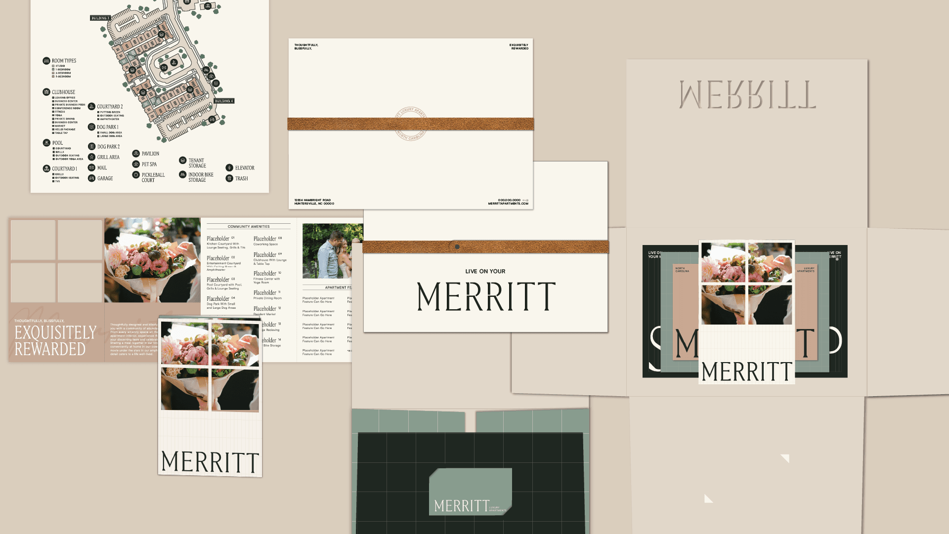
The hurdle was the sheer scale. We needed a system that worked for a tiny social media icon, a high-energy animation, and a luxury quality experience. My job was to ensure that "Live on Your Merritt" didn't just feel like a tagline, but a tangible standard of excellence.
The Strategy
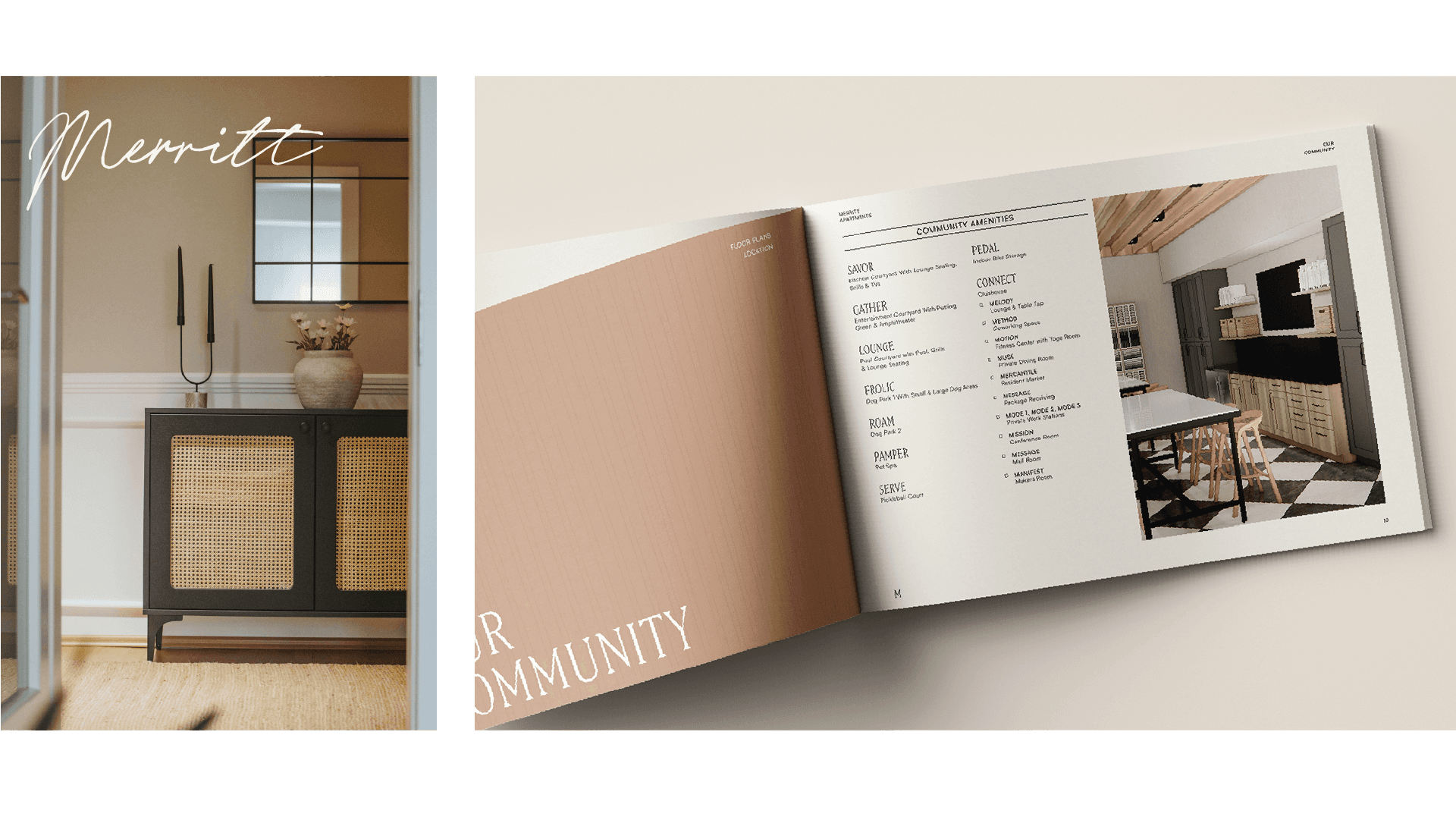
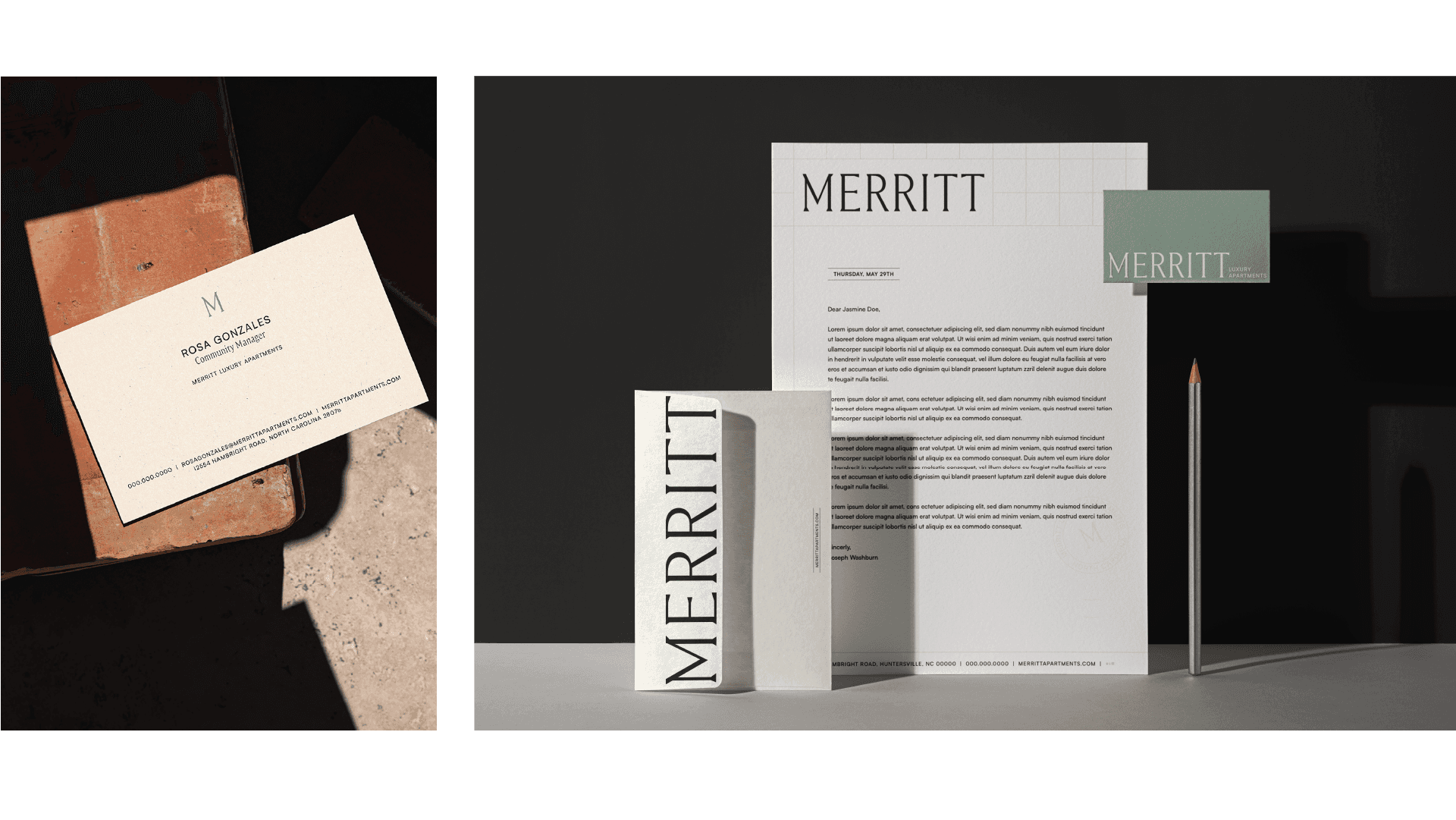
I anchored the entire activation in the concept of "The Reward of Place." As Art Director, I guided the team to lean into a palette and typographic system that felt confident and convenient. We utilized elegant quartz textures and modern grids to reflect the physical apartment features.
I didn't treat these as 14 separate tasks; I treated them as one singular ecosystem. For the digital and animation pieces, we focused on "fluid quality"—using motion to mirror the effortless suburban living the location provides. For the print and collateral, we focused on the "Tangible Measure"—using high-end materials that matched the "Signature" resident experience I helped define in the brand playbook.