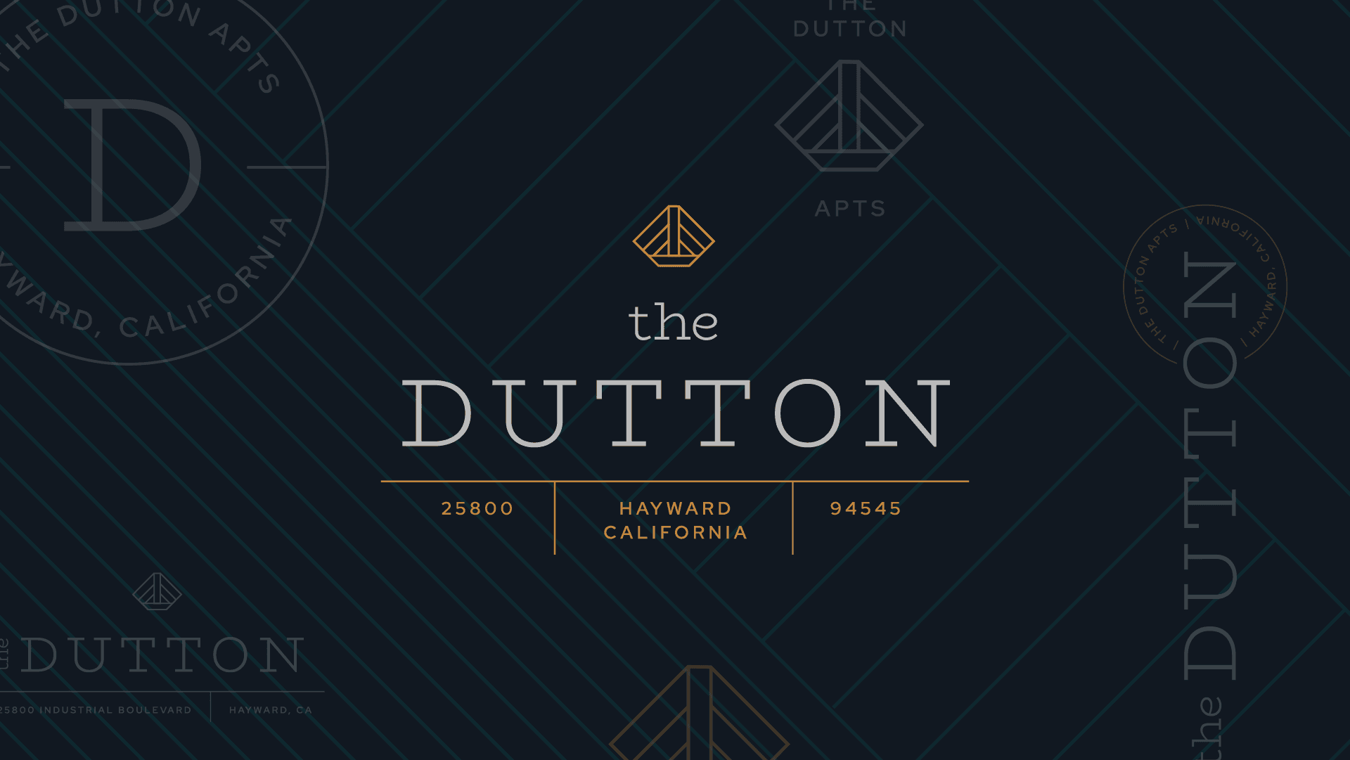
The Dutton
The Challenge
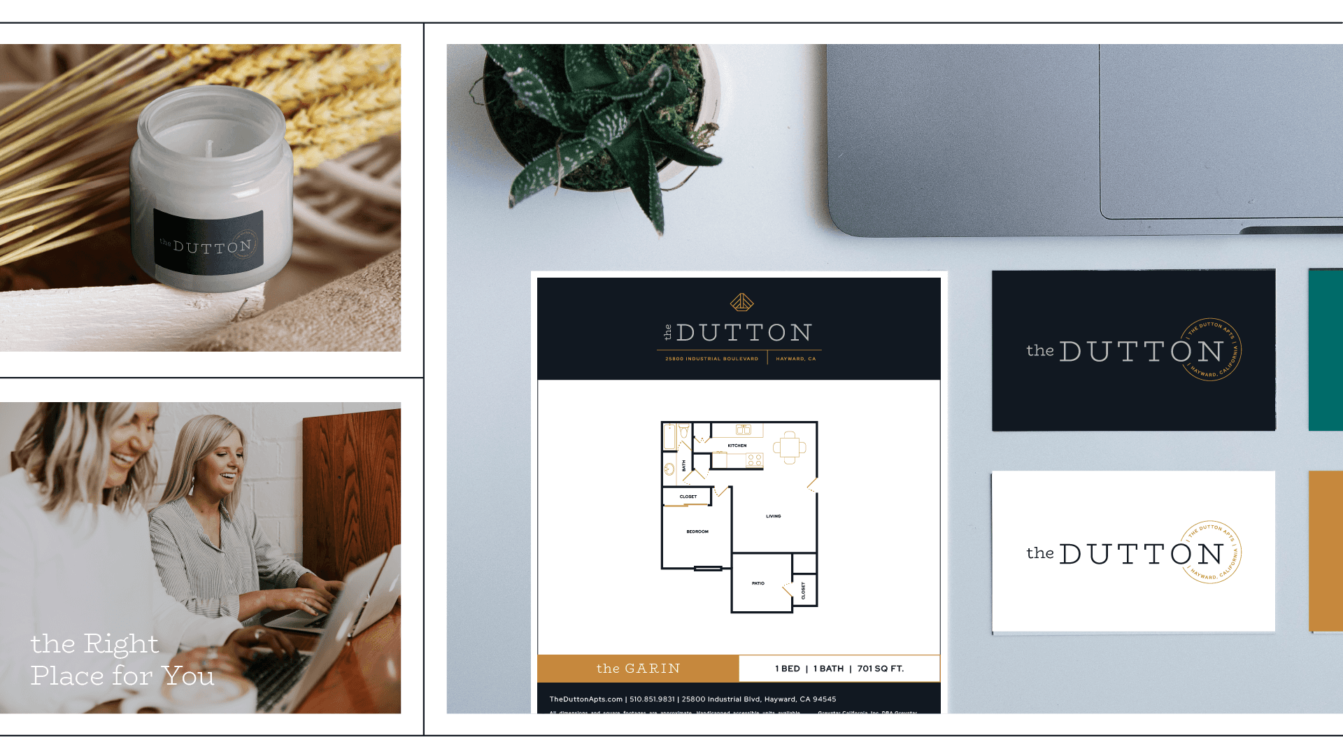
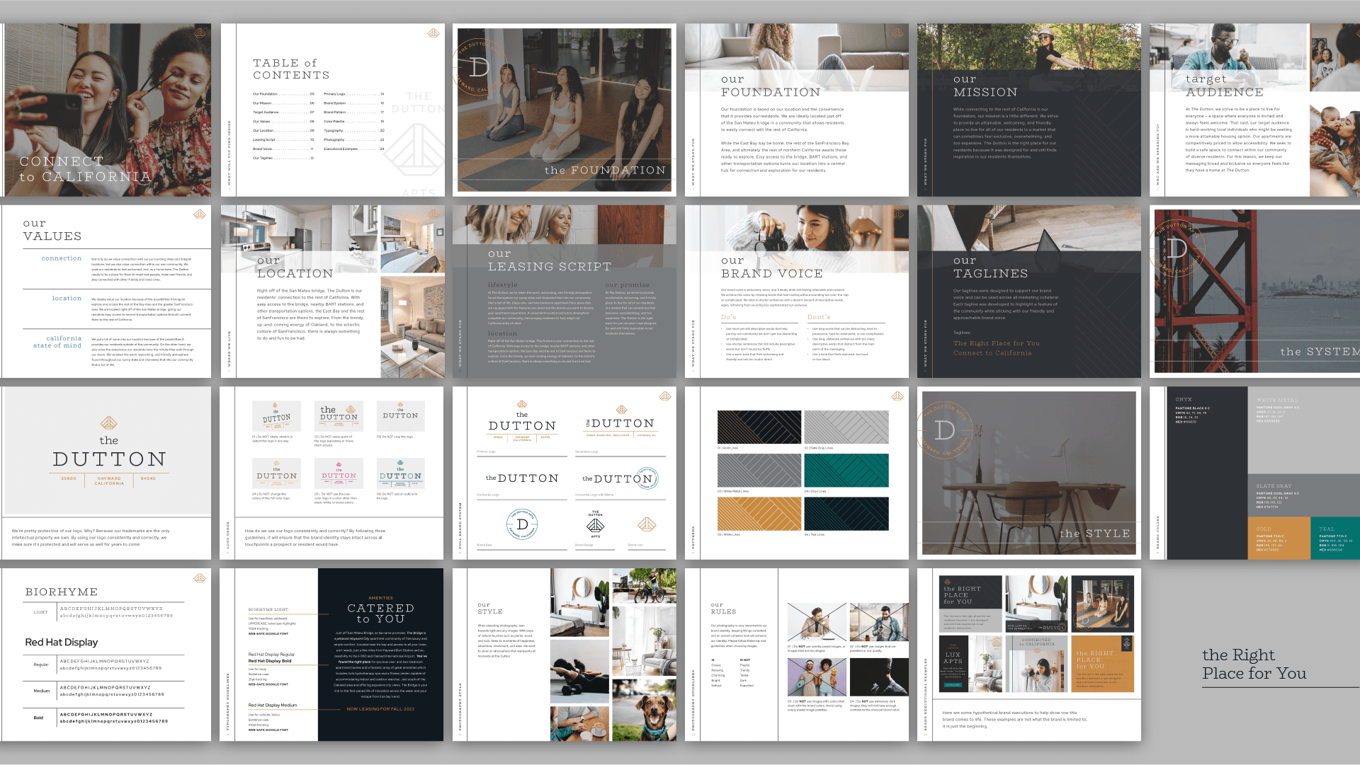
The Dutton was at a crossroads. Located just south of Oakland with expansive city views, the property had the location and the "bones," but lacked a soul. The new management needed more than just a name—they needed an identity that felt like an escape.
The goal was to attract a specific mix of young professionals and new parents who are constantly crossing the bridge into the fast-paced innovation of San Francisco, but crave a classic, rustic sanctuary to come home to at day's end. We had to bridge the gap between "affordable housing" and a "refined, luxury experience."
The "How"
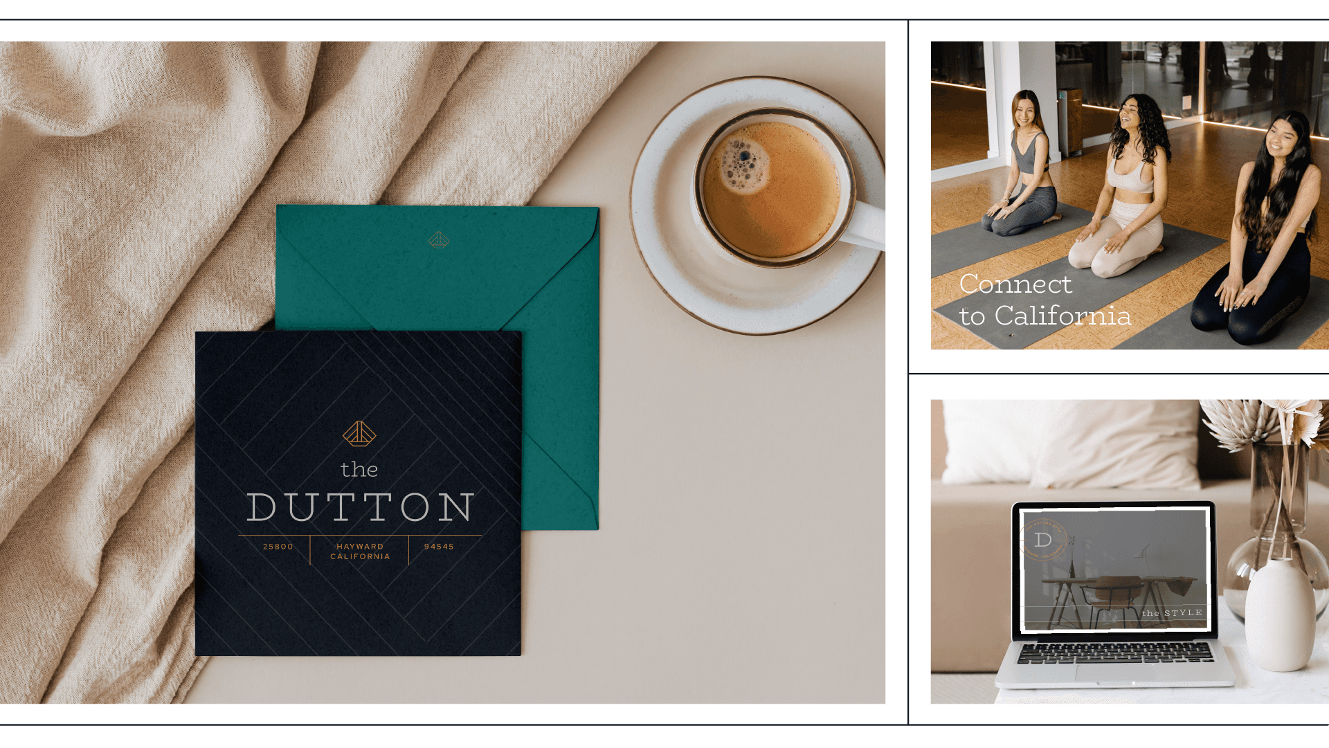
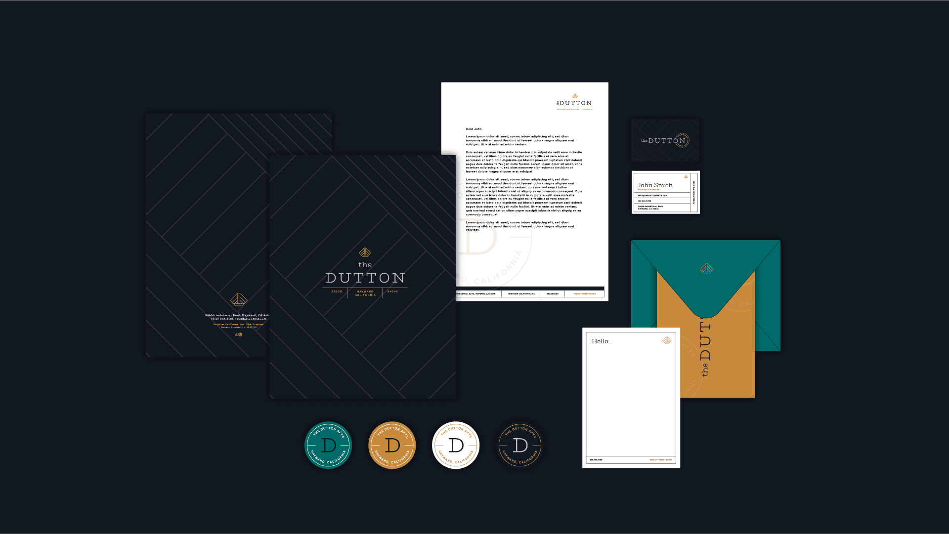
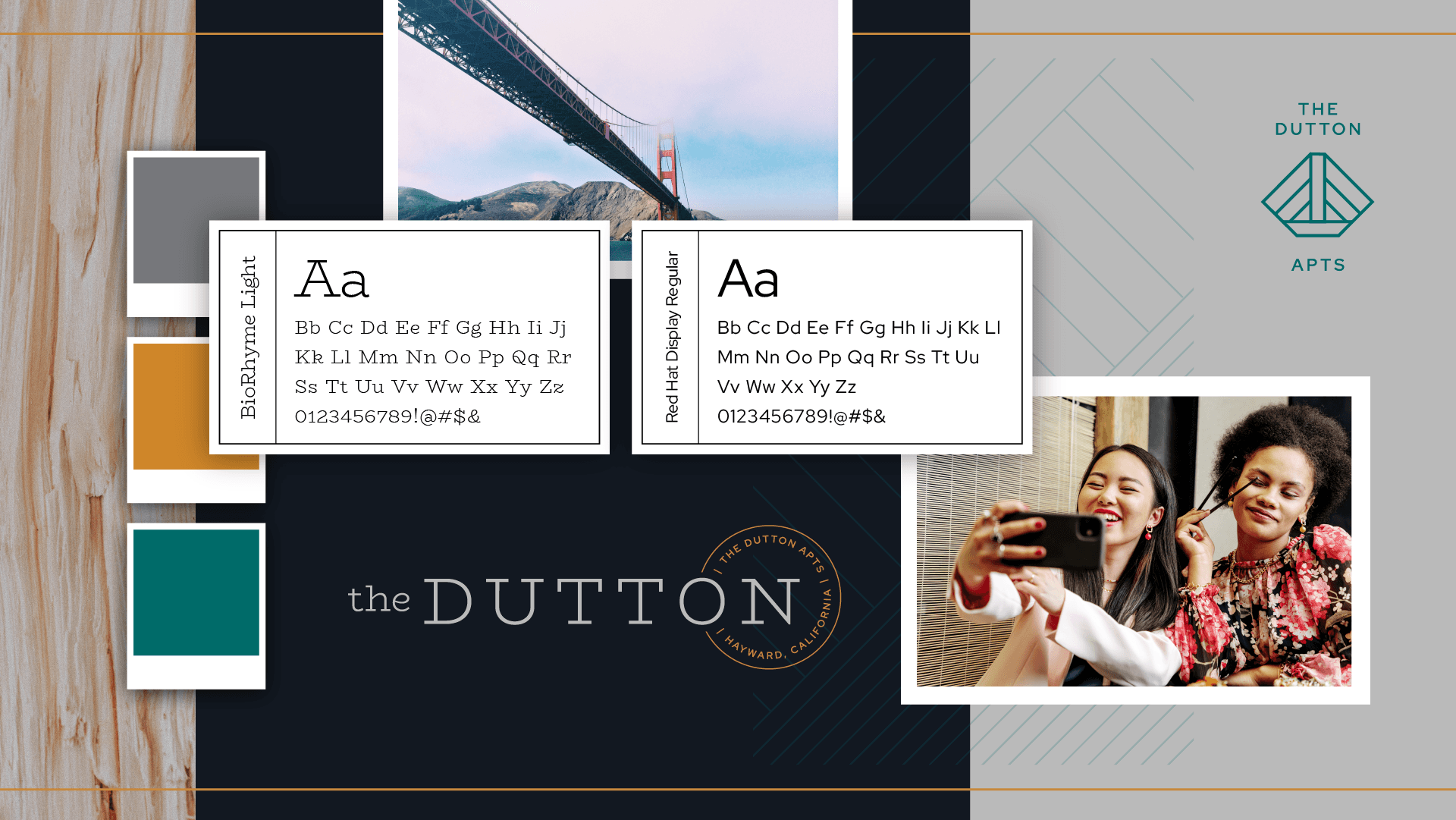
We leaned into the property's greatest amenity: Connection. Inspired by the iconic bridges of the San Francisco Bay, I developed a visual language rooted in structured grids and clean, architectural lines. By utilizing a "refined edge," we moved away from the typical corporate housing look and toward something that felt sophisticated and curated.
The Strategic Choice: We balanced the rustic, vintage request with a modern, high-end grid visual identity. This ensured the brand complimented the property's physical uplift, making the community feel luxurious and established before a resident even steps through the front door.